Thursday, October 21, 2010

Week 5: Animation

This week's focus was to introduce animation into the classroom. In the workshop we looked at a number of websites-some useful and some to be cautious of.
The first website we explored was called Zimmer Twins. (http://www.zimmertwins.com/)
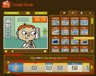
This website is fantastic. It is easy to use; it works on a story-board basis.
Movie making or animation software can often become too complex and confusing. This website is catered for children using simple action/speech inserts. When one inserts an action/speech, it becomes a scene on the storyboard below. By adding more action/speech inserts the students create an animation.
While it is comparitively restrictive, students do have the option of choosing which charaters they will animate, the setting, and even some objects.
I would use Zimmer Twins for grades 1 to 4.


The next website we explored was called Xtra Normal (http://www.xtranormal.com/)


This website has a great concept. People can register and start making thier own movies. The fantastic thing about this website is that there is no voice recording, but the characters can speak. Simply by typing what you want them to say, the characters say it with very close lip movements.

While it is a great concept, I would not use it in the classroom because the advertisments on the web page (depicted to the right "the cubicle") also show other titles not suitable for children. People who register for this site must also be over 13. See below.


The third website we looked at was a how-to-guide for creating animation. It is called Roller Mache. (www.abc.net.au/rollercoaster/rollermache)

In my classroom I would like to integrate animation creation. While it may not be something that everyone enjoys, one or two students may find it extremely interesting and persue it as a hobby and maybe even a future one day. In my classroom I would like to expose students to different professions and disciplines so that they can start to have some kind of direction in their future.


This website gives a how-to-guide on creating story boards, characters, and then the animation itself. I would say this website is for teachers rather than students. Teachers can get detailed information on how to create an animation, and then have the class or small groups make one.

There is also a gallery on the website. Students can upload their work.

The next website is called Reasonably Clever. (http://www.reasonablyclever.com/)
This website allows students to create their own lego characters and put them into comic strips. This website has a child-safe section.

The last website looked at is called Zip Tales. (http://www.ziptales.com.au/)

This is a website created in Ballarat that animates stories for children. While it does have a subscription fee, it could be a useful teaching tool for students who do not like literacy.


The view of "what literacy is" has changed over time however some teachers are still finding it difficult to depart from the traditional view of literacy: basic reading and writing. Anyone who goes into the classroom and practises this kind of literacy is doing a dis-service to their students.
Geoff Bull and Michele Anstey published an article in Practically Primary, Volume 12, number 3, October 2007. The article is called "Exploring visual literacies through a range of texts." This article explores the numerous encounters we have with literacy during breakfast time. Literacy, Bull and Anstey argue, pertains to the human semiotic system: our sign reading systems. So that does not just jnclude simple linguistic signs, but also visual, oral, auditorial, gestural, and spatial.

Students should be exposed to a variety of literary forms: books, videos, plays, animations, music, newspapaer, comic strips, advertisments, and more.

Visual learning is something I plan to implement into my classroom.

Tuesday, August 17, 2010

WEEK 4: M&Ms and Mermaids


This week presented us with a fantastic approach to integrating M&Ms into math. I really enjoyed this lesson. All students were asked to bring a packet of M&Ms to class. The task was to graph the different colours in our packets. We were given a sheet first to graph it.

(Left)


After this we were asked to enter our data into Microsoft Excel spreadsheet. A chart was created showing the different colours in our packets. (Below.) Everyone's numbers of the colours were different. This could be a good time to look at mode, mean, median, and range. For example, based on the chart below the mode is 6. The mean is 9. The median is 7. The range is 13. Just doing this could be a lesson in itself. Students could then group together, add their results, and figure out the new mode, mean, median and range. However I would want the students to represent this in some way on a graph or number line. It needs to be made tangible so that students will retain the information.


After we completed the chart we continued on with graphing the M&Ms. This was really exciting: I didn't realise how simple it was to create a graph. We were also shown how to Change the colours and backgrounds of the graphs. In the end, I was very pleased with what I was able to create. (Below)


This activity could be followed up by looking at the nutritional information: looking at kilojoules; fat content; or sugar content. This could be part of a health class. If you were looking at fat content, you could look at the suggested fat intake per day and look at how much a packet of M&Ms would contribute to that.


If any students have allergies, this can be done with another topic such as hair colour, height, ethnic background (if it is a diverse classroom), First letter of a name, etc. There are many possibilities.


The second part of this lesson we looked at a website called DustEchoes. This website is fantastic. I would very much like to use this website in my classroom. We had a look at the video animations on this website. Using the video, we cut and pasted scenes from it into inspiration to create a story map. (Left) The story map I created was of the video called Mermaid.
This would be a good activity to do with students. What is great about this website is that each video comes with a study guide. This study guide contains many different ideas for lessons.

WEEK 3: Technology and thinking

This workshop was broken up into two separate learning areas: Quia games and design briefs.

Quia games is a very interesting website. The variety of games can be very useful in the classroom. Although it can be something for the whole group, more than that, I can see potential for this website to be used with students below the VELS standards and extension students. I think these games would be fantastic when personalised for particular students. If in a class you only have 2 or 3 students in need of extra attention, it would not take long at all to prepare personalised games for them. These games could also function well as an engagement activity. The use of something like hangman on an interactive whiteboard would be great for students. Immersing students in technology everyday can only prepare them better for a future that will be dominated by information and communication technologies.

Having said this, as teachers, we need to be mindful of the method of immersion that we use. It is very simple to give students a research project and send them off to use websites as resources, and create a PowerPoint presentation. In this scenario students are just going to a website, and when teachers have their backs turned, copy and paste information into their presentation. This is a very low order of thinking (in fact I don't think it even registers in Bloom's Taxonomy.)

When integrating technology in the curriculum we should always questions ourselves: Am I challenging the students to use higher thinking orders? Often we get distracted by the flashiness of a program and forget the learning objectives of a lesson.

The danger of modern technology today is that students have all sorts of information just a click away. Whatever the students need to know, they can find it on the internet. (There are even instances where people download whole essays off of the internet.) Because of this ready access to information, thinking has lost its importance and value. Students don't need to analyse, synthesise, or evaluate information because surely someone has done it before and made it available on the internet. We are all guilty of this behaviour; rather than thinking we choose to search the internet. The funny thing is that people will search for hours on the internet to get to a conclusion that they had the potential to reach if they would have just stopped and thought about it.

To promote higher order thinking when using technologies there is a new approach called online learning communities. (You can learn a little more about it here.)

Basically students are a part of this online community where they are able to collaborate and communicate electronically. Supporters of this approach boast an 80%-90% knowledge retention. These online communities are basically taking classroom discussion into the 21st century. I personally feel that regular collaboration and communication is also effective, however, a healthy mix of the two would keep students motivated.


Design briefs also promote higher order thinking. Through group collaboration students are given an objective; they are then challenged to investigate and design; produce; and finally to evaluate and analyse.

The investigate and design phase of the design brief is for students to collaborate and brainstorm. They think of ideas (without touching any materials at this point.) Students are using comprehension and knowledge.

The second phase is produce. Students take their ideas from the former phase and make them tangible. This is using application.

The third phase is analyse and evaluate. Students need to think about what they did and what they could do better. If they did not reach their given objective, they will need to go back to the first phase. Although it seems like it may be time consuming, students will actually move through the phases quite quickly.

During this session we were asked to make a frog jump using glue, scissors, sticky tape and elastic band, and cardboard. It was more difficult than I thought. But it was a great process. We were thinking! It was great to see everyone's ideas.

What is great about using design briefs is that there is one objective for everyone, but the results are very diverse. Students come up with different ideas. Going through the different phases of the design promotes good thinking skills and strategies.

Probably the most important thing to remember here is that it is the process not the product that is important. It is imperative to value ALL students' ideas.

This approach to design is very clever. It incorporates all levels of thinking.

All of de Bono's six thinking hats would also be used in this process of design. De Bono segregated thinking strategies into hats that students can take on and off to help them articulate the type of thinking they are using. (Click here for more information and lesson ideas.)

The white hat is unbiased. It collects the facts and information.

The red hat is feeling and emotion. Students can say what they feel and think without explaining why.

The black hat judges what the problems might be. Scepticism. Rationality.

The yellow hat thinks of positive outcomes and benefits.

The green hat creates and designs.

The blue hat oversees all other hats and tells us when we might need to wear one of the other hats: Metacognition.

If we were to apply this to the design brief approach; phase one would consist of white, red, and greens hats; phase two would consist of green hats; and phase three would consist of blue, yellow, and black hats.

I really like the design brief approach to learning. I believe it teaches a skill that is vital throughout our entire lives.

Tuesday, August 10, 2010

WEEK 2: Publisher, Profession and Portfolios


This week we learnt how to make a brochure on Microsoft Publisher. Students are often asked to create brochures for various tasks at school. During my last practicum students were working on a unit of work on an Australian state or territory. One of the tasks was to make a brochure. My mentor teacher was not very technologically inclined and so had them complete this task by hand. Problems with this approach were that the students were not very engaged; their work was very messy; and it wasn't substantially different to the other tasks in this unit (poster, website design, etc.) Everything was done by hand (even the website design.)

(Here is an example of a brochure design created on Publisher.)


If I was leading this task I would first make the students confident with any software, information, resources, and techniques they may need. For example a lesson could be spent on how brochures are written. Have a look at real-life examples. What kind of language do they use? What information goes where? What kind of format do brochures follow? I would then get them to create a practice one.


During these sessions, I think I was asked by 50% of the students "What should I write?" in regards to the brochure. This would be a fun interactive way to help them with their task. (And also practical! This is a skill that they may need later on; as useful as word processing.) Using Microsoft Publisher was never something I enjoyed because I simply didn't understand it. Some of that mystery has now been unshrouded. The portfolio/website template could also have been used in that unit from my practicum for the website design.


We also had an in-depth conversation about job applications. This was a very informative session. I received many answers to questions I have not yet formed. This course is so compact with information and assignments that I have been doing my best just to keep up to date with classes and deadlines. To have this advice session was invaluable. I am very grateful for it. The application process seems lengthy and precise, but it does make me wonder how effective it is. It is no secret that there are some teachers in the field that could do better to improve themselves. How do they get these jobs? Even in my classes here at university I can see there are people who may become "at-risk" teachers. The daunting thing is that they have a good knowledge of theories and pedagogies, and also have a silver tongue. With this they will be able to slip through the interview process and into a school where the students will suffer for this person's lack of passion for their profession. I think there a many people who have potential to be amazing teachers but they just haven't had the time to get themselves together in this short year.


We also learnt how to create e-Portfolios. I have only one reservation about ePortfolios to support learning. To create an extensive portfolio spanning a student's entire school life, each teacher each year will need to be committed to compiling the portfolio for each student. This demands a lot of cooperation and work.


ePortfolios and regular paper-based portfolios have been discussed. The benefits of ePortfolios are indisputably greater than those of a paper-based one. Multimedia is described as a collection of all sorts of information representations: text, audio, graphic, and video. Paper-based portfolios at best are restricted to text and graphic. The addition of video and audio open up a whole new world of information to transmit to an intended audience; and in such a digital society, may even do this more effectively. C. Armitage printed an article in The Australian on the 16th of December 1998 entitled The benefits of pause for thought. In this article Armitage argued that ePortfolios result in higher student motivation and self-confidence as their work is being published in a sense rather than merely complied (paper-based approach.)


It seems that ePortfolios have clear benefits for both teachers and students.

Tuesday, July 27, 2010

WEEK 1: Blogs and Brainstorming

Today we learnt how to use Inspiration. I can see how this program is very useful. It can be used in many different contexts. It can be used individually, in pairs, groups or even as a whole class. I think that the infinite possibilities with this program will appeal to children and adults alike.

Inspiration is a software program used to create mind maps and concept maps. This software focuses on visual learning. A mind map is a visual way of taking notes. Often at the beginning of a topic, teachers will create a mind map with the class. One word will be written in the centre of the white board and all ideas students have will be written around the word. Although students often participate they are not often engaged. Creating a mind map in this sense is out-dated.
Mind maps rely heavily on mnemonics. Certain words may trigger a memory in the minds of some students. For example, If I hear an anecdote in one of my university lectures about a teacher from Bendigo that created a new teaching theory that has been a success and caused a paradigm shift, I may just write the word "Bendigo" and when I come back to these notes in the future, seeing that one word will trigger the anecdote in my mind. Mnemonics are like zip files on the computer: They are something small, but when unzipped, they contain a lot of detailed information.
Just to prove how powerful mnemonics can be we should look to the Japanese writing system of Kanji. At a very early age Japanese students are expected to know a large amount of these complex characters. Many of them often look very similar. To help students remember these, little stories, or mnemonics are taught to students to help them recall the character. A full list of these can be found here.

The use of Inspiration in the classroom can only go as far as the teacher's understanding of the software. I am grateful that I have had the chance to experience this software before going out into the workforce. The way the teacher makes this software available to students is integral. The fact is that it is a very useful tool that can be used in a variety of contexts. The teacher should introduce students to this program and allow them to use it in any subject. Technology sceptics (I imagine) would implement its use in a controlled software focused lesson. That is, they would have a lesson planned specifically designed to use Inspiration to complete a set task. I believe this limits the creativity and personal responsibilities of a student. I would like Inspiration to be a program on the computer that students decide to use at their own will. I would like it to become as common as Microsoft Word or Paint Shop Pro; a program well known and often used by the students. Students should decide when to use this program, not the teacher.

That there are very limited boundaries means the students can run with their imagination. It is often said that the aim of a teacher is to educate the whole child. However I believe that often the development and fostering of creativity is forgotten in subject specific curricula. Creativity is often left to the arts domain. Inspiration offers a way to nurture creativity in students in any subject.
If used correctly in the classroom, I believe teachers will see improvements in the Communication and Personal learning domains in VELS.

Student and teachers are sure to get a kick out of using this program. It is a dynamic program. That will keep children and adults focused.

We also learnt how to use online blogs. This could be very useful to set up a classroom discussion on a specific topic. Perhaps the teacher could start off with a general topic or issue and as students learn more about it in class, they can add comments and bounce off each other.